Sofology
Latest Store Concept
je+1 have been supporting Sofology with their stores for some time, and were more recently asked to develop a new concept for their new locations in Southampton and Inverness.
Location
Year
Services
Nationwide
2023
Insights, Strategy, Concept Design, Interior Design, Communications, Digital Applications, Bespoke Applications, Project Coordination.
Share
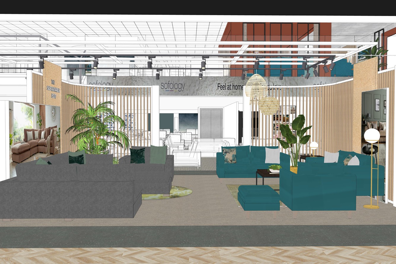
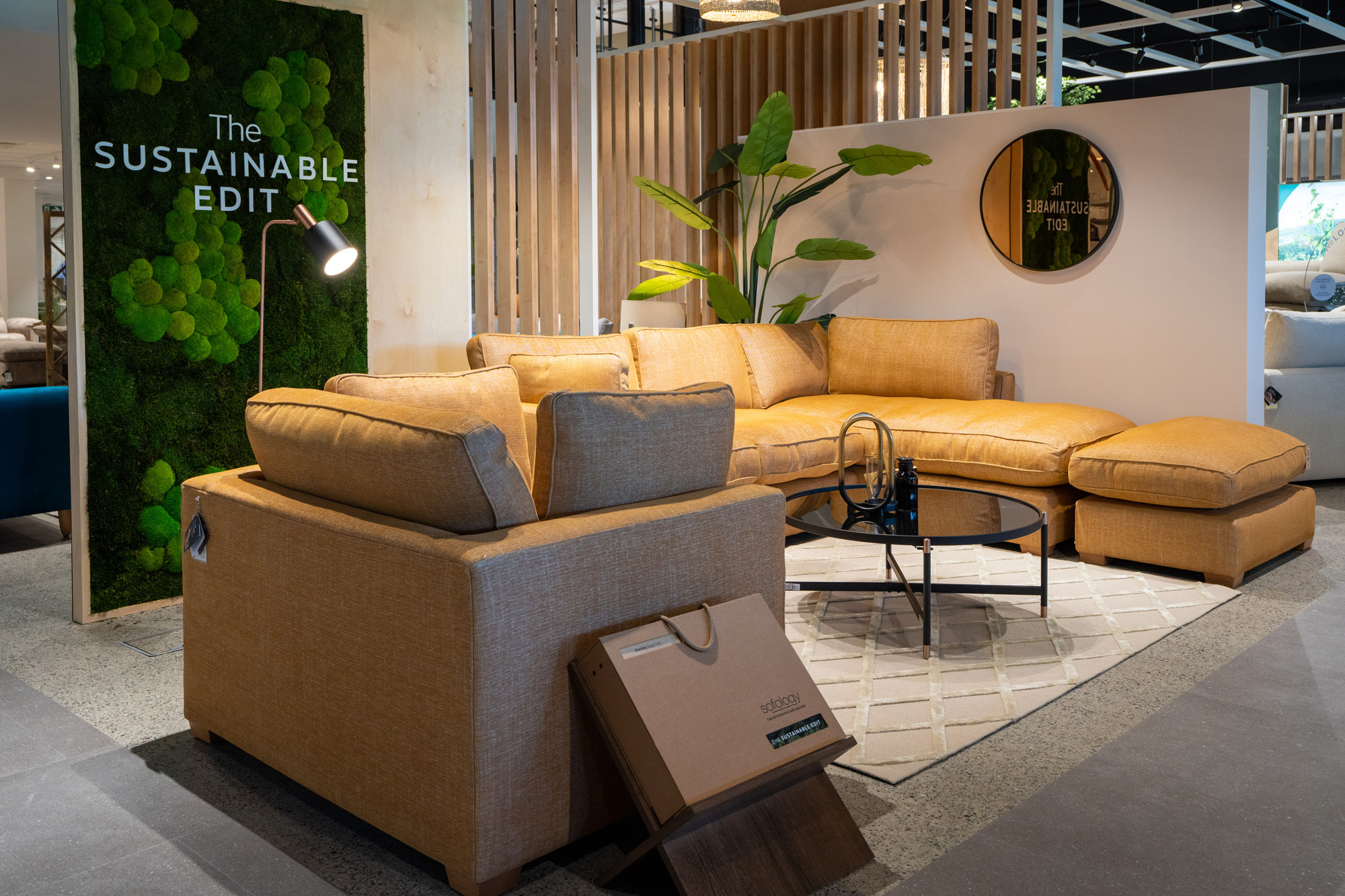
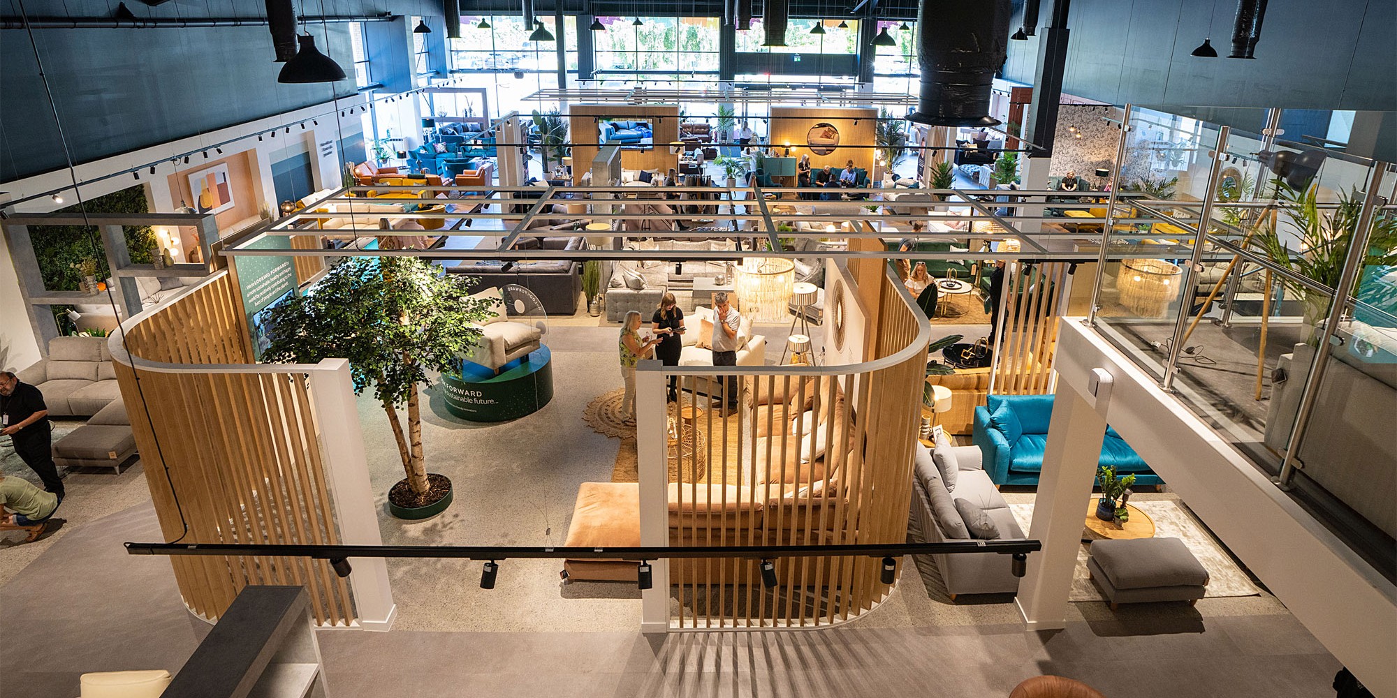
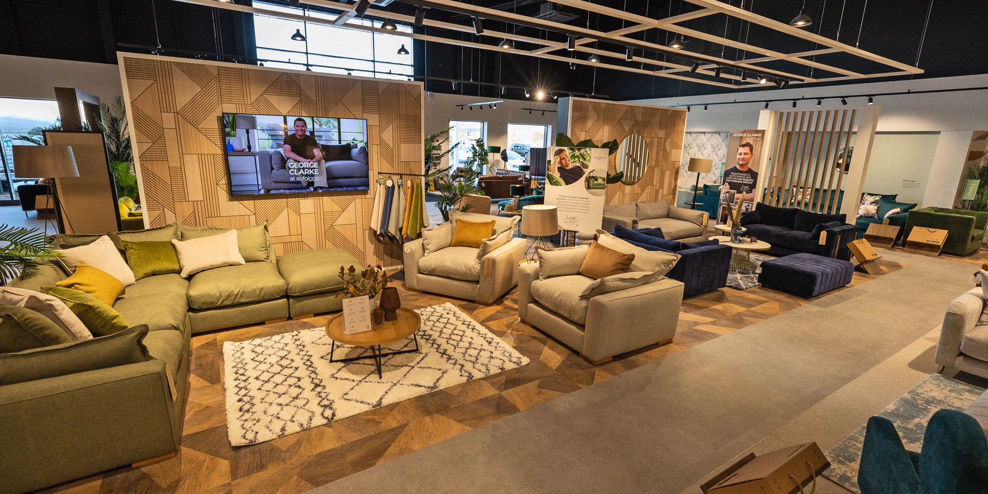
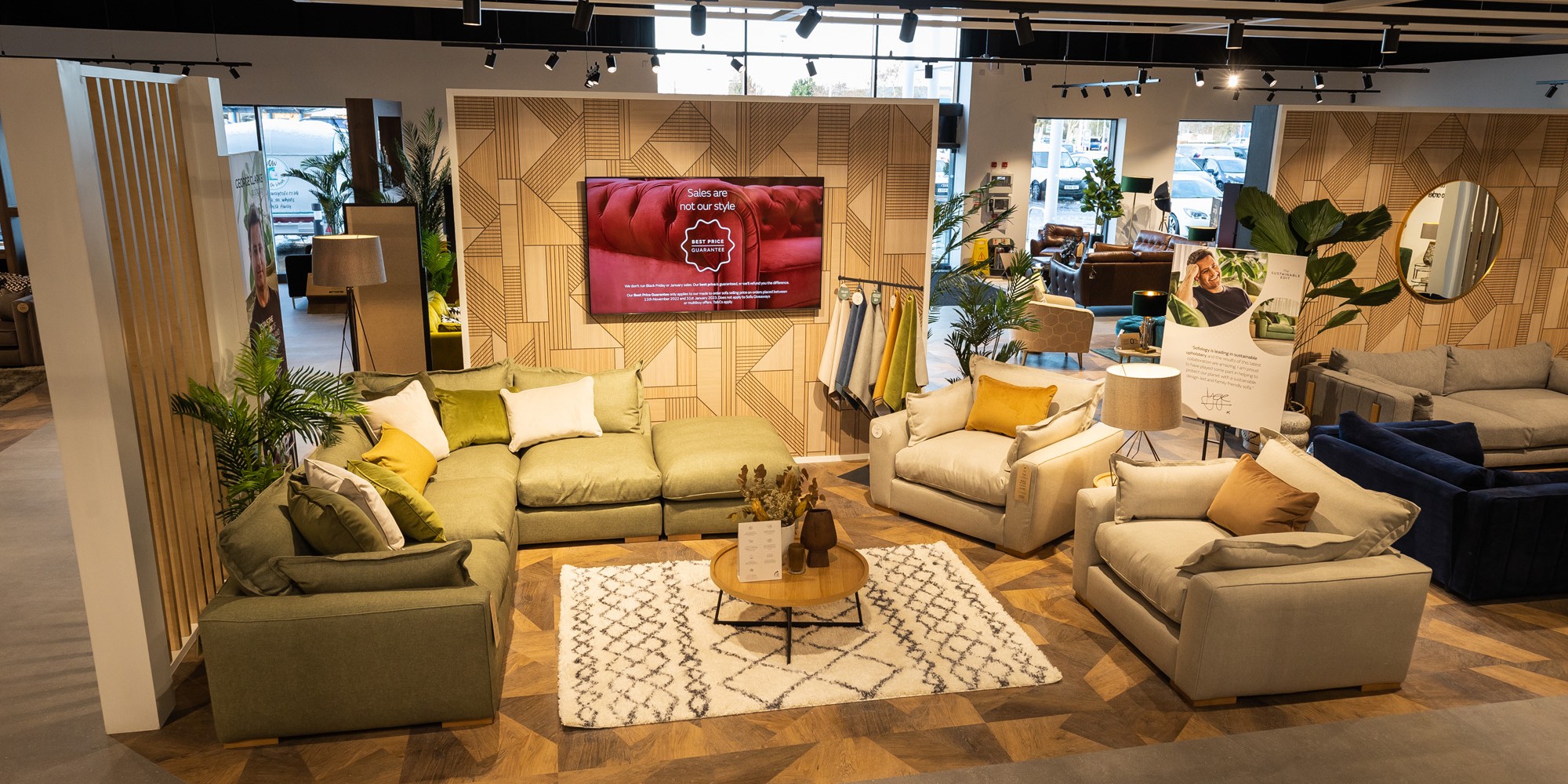
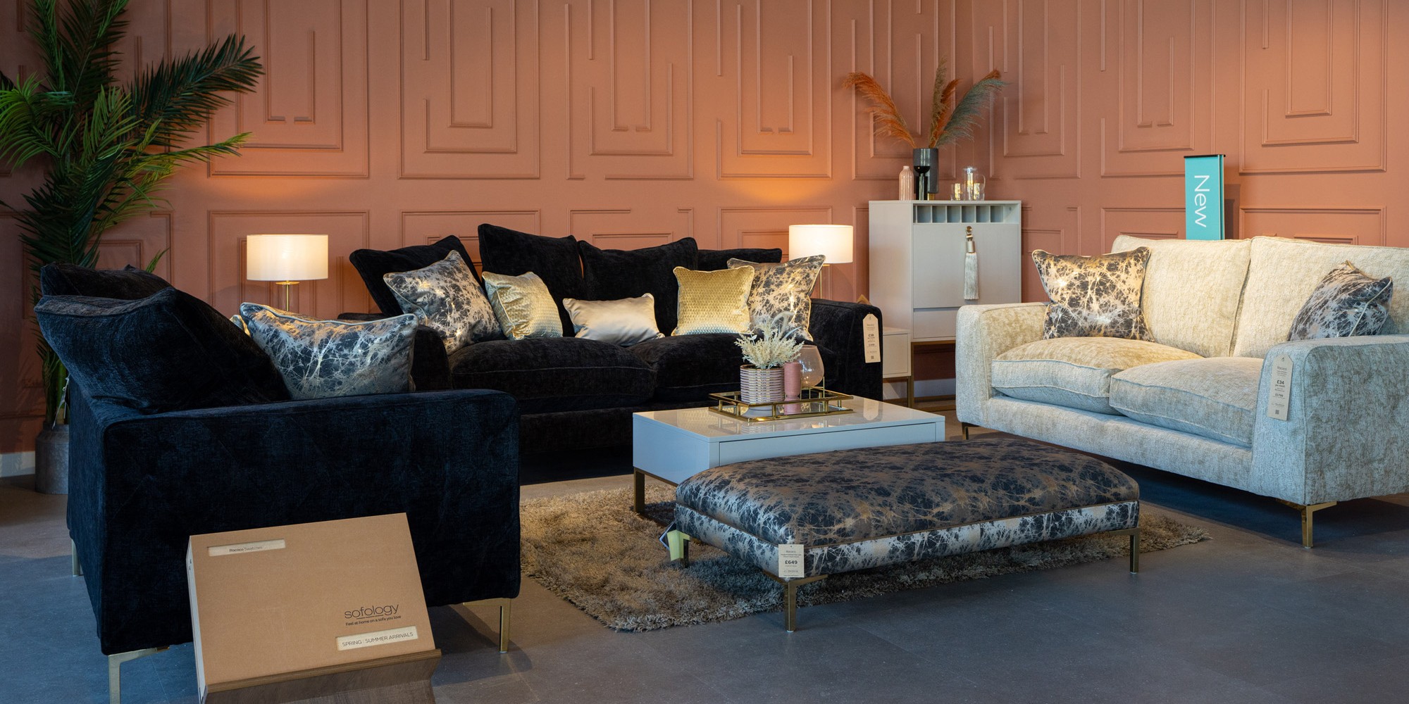
Considering a fresh approach, the new concept encompassed some existing strategies alongside new design features in prime locations to present the key brand propositions, such as ‘The Sustainable Edit’ and ‘George Clarke’.
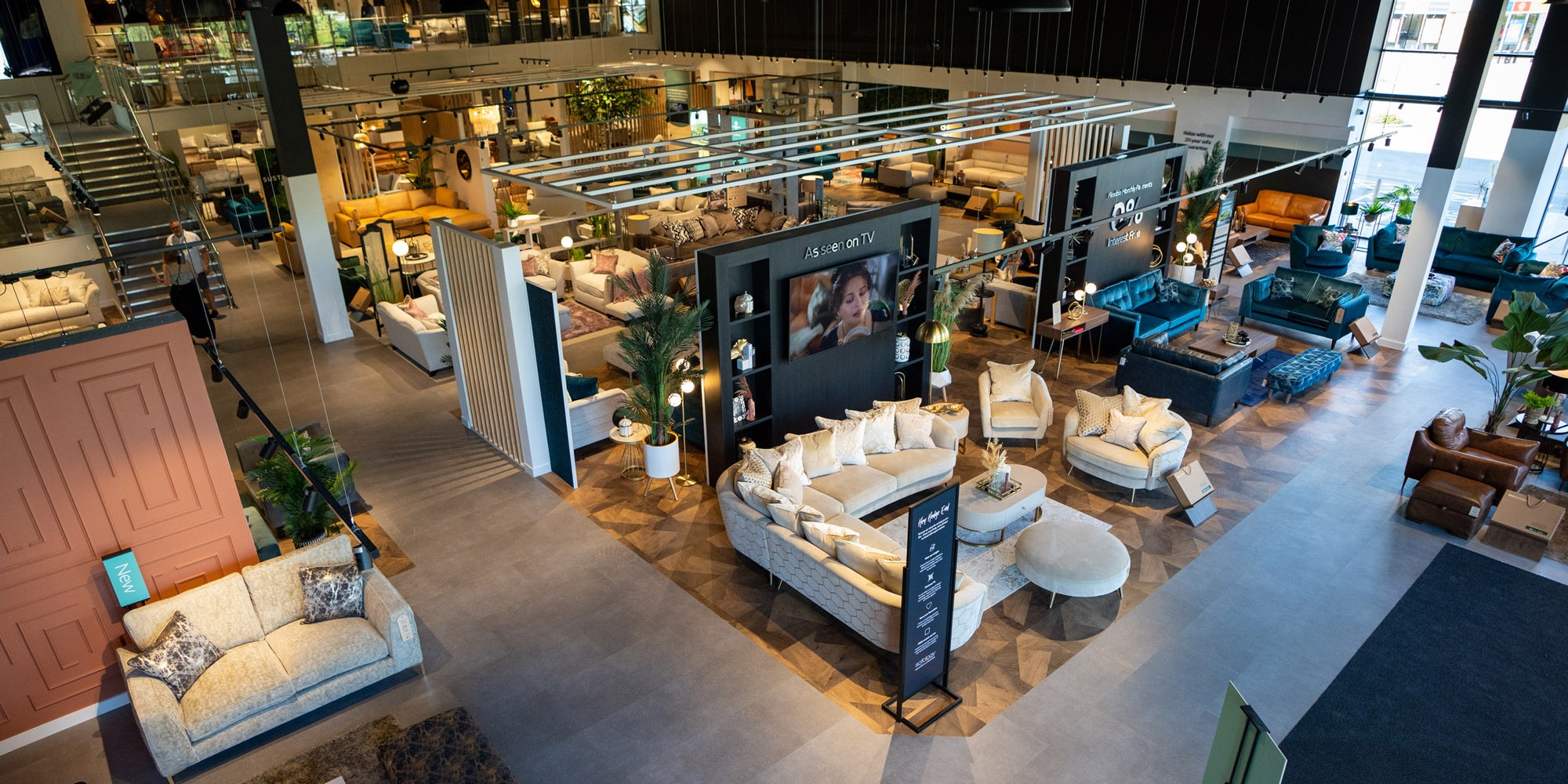
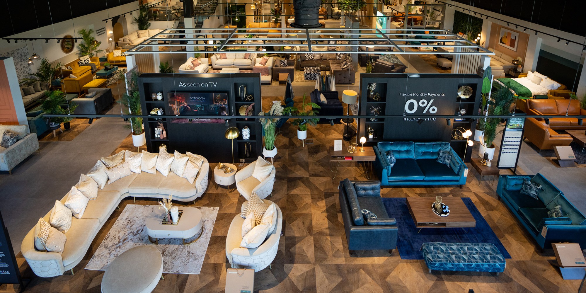
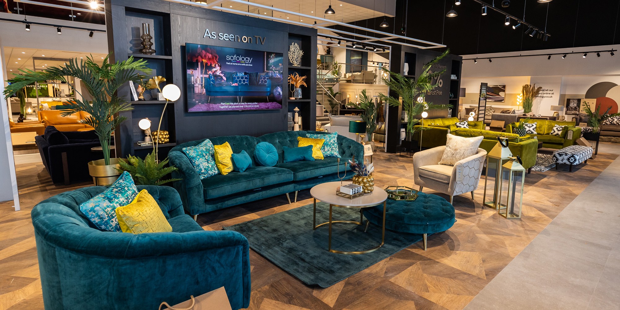
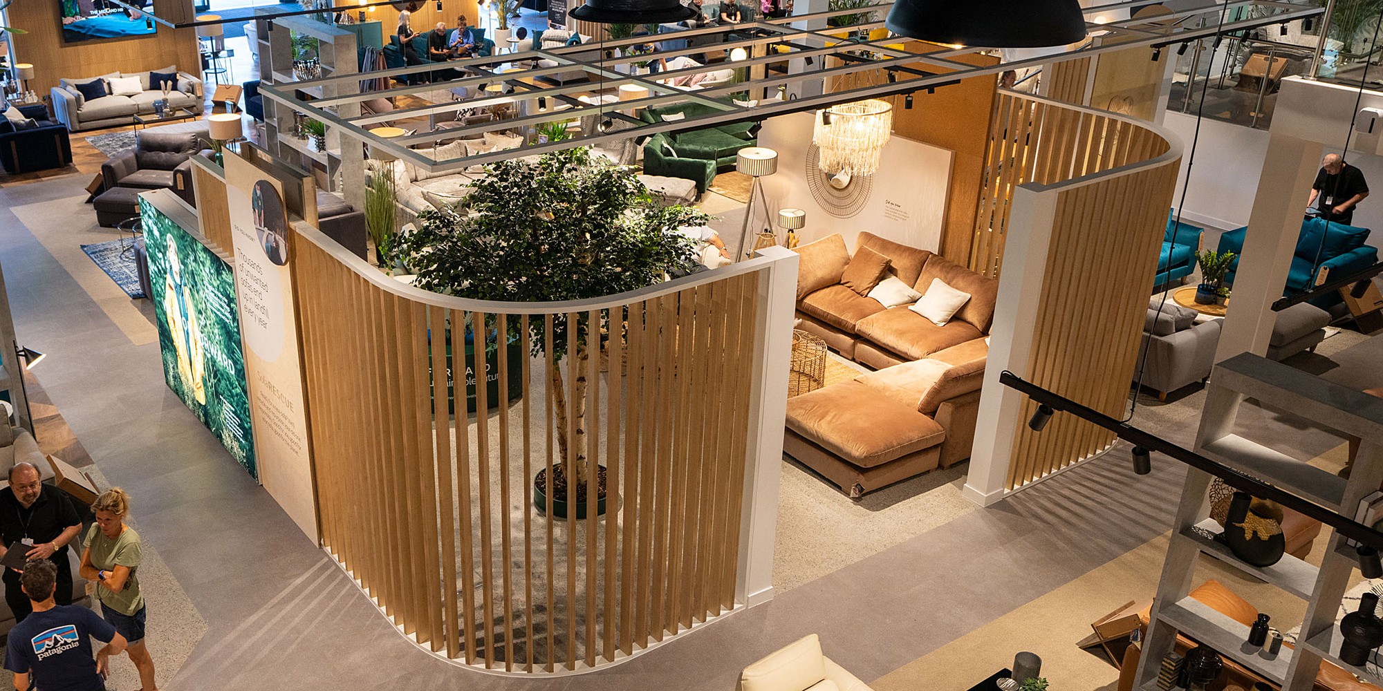
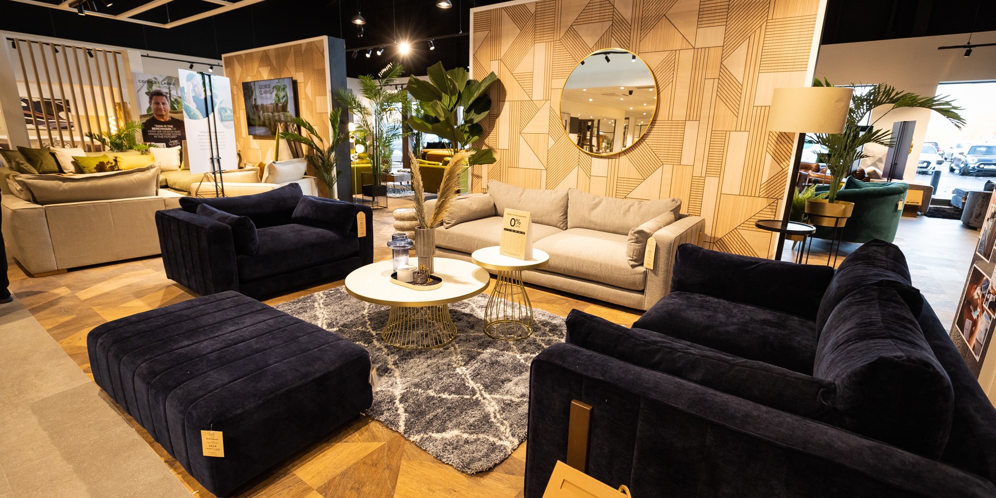
Initially we carried out a review of their existing store planning strategy and created larger, flexible zones within the central area of the store. New floor finishes were used to achieve this, on occasions breaking up the traditionally used, ‘walkway’ around the store and ultimately creating ‘pause points’ for the customer to stop and take in the ranges presented to them.
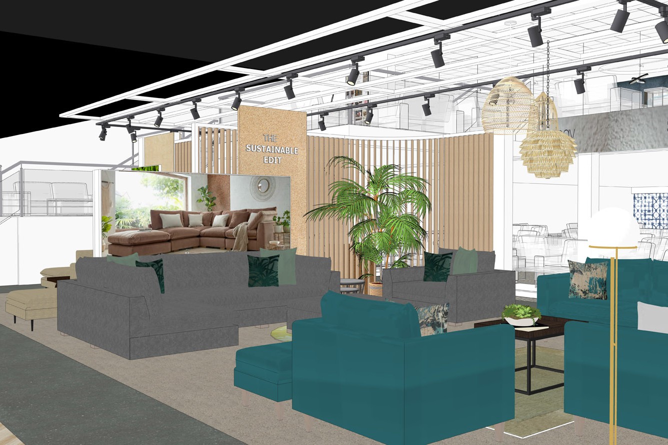
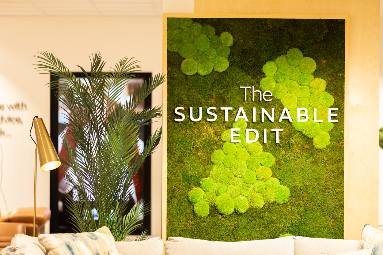
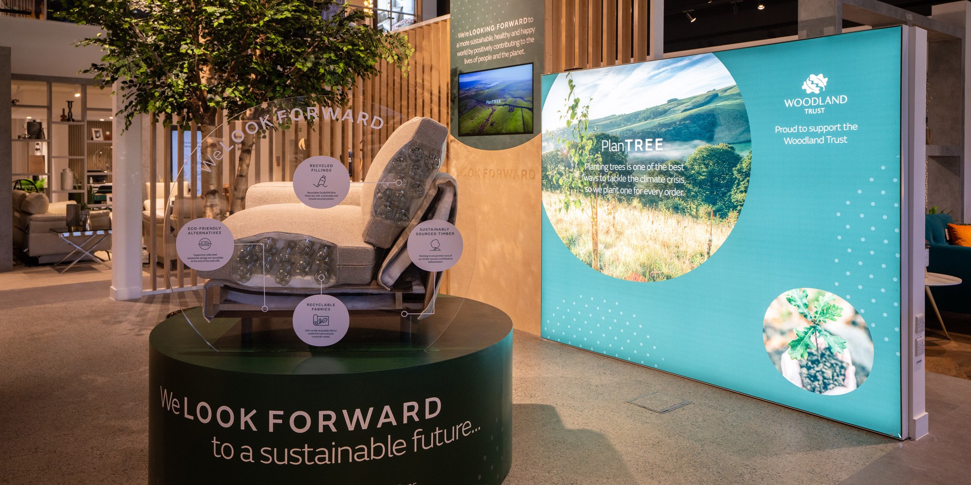
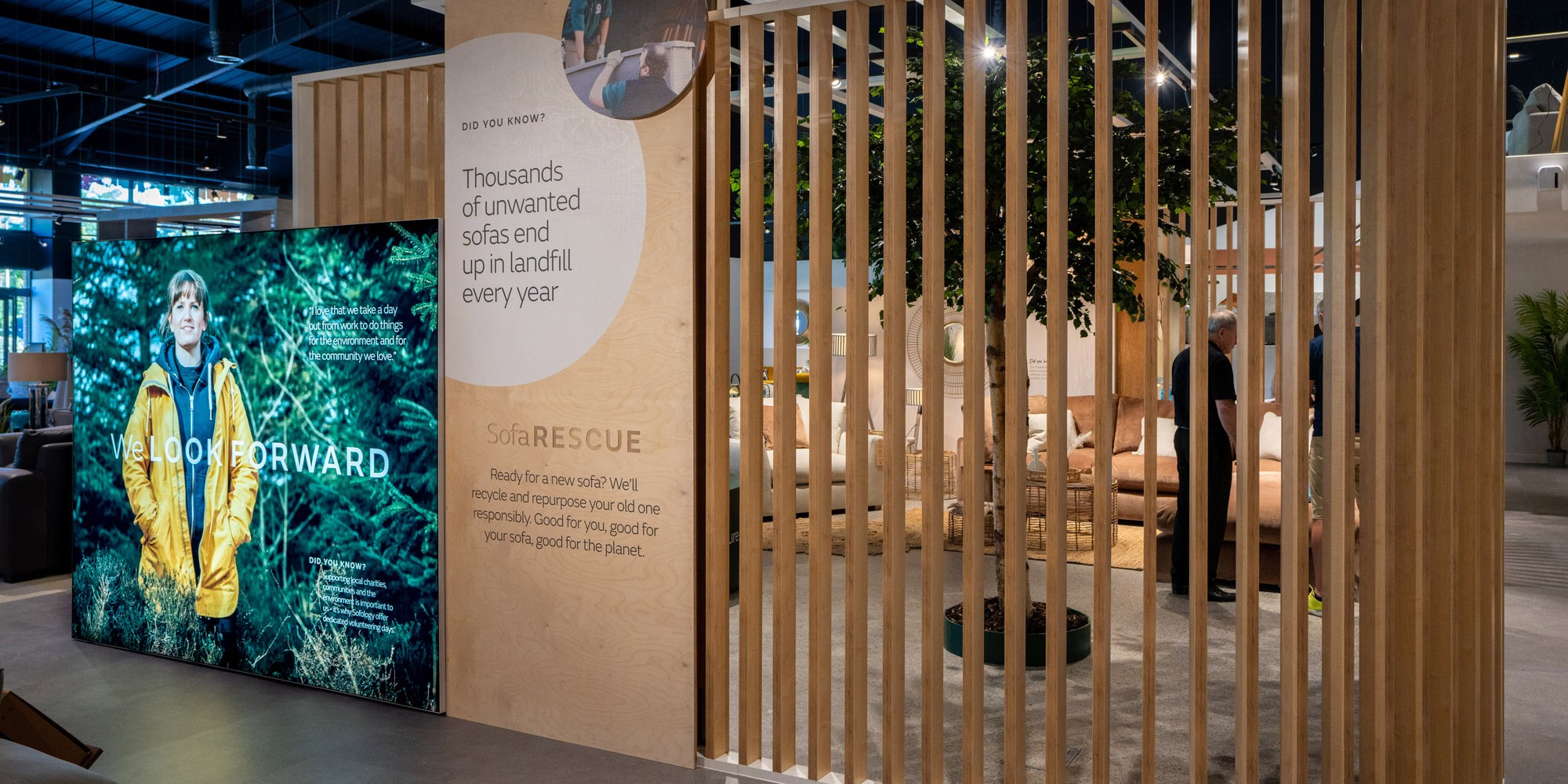
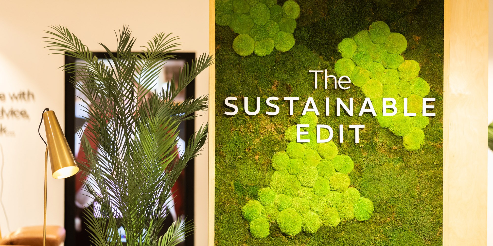
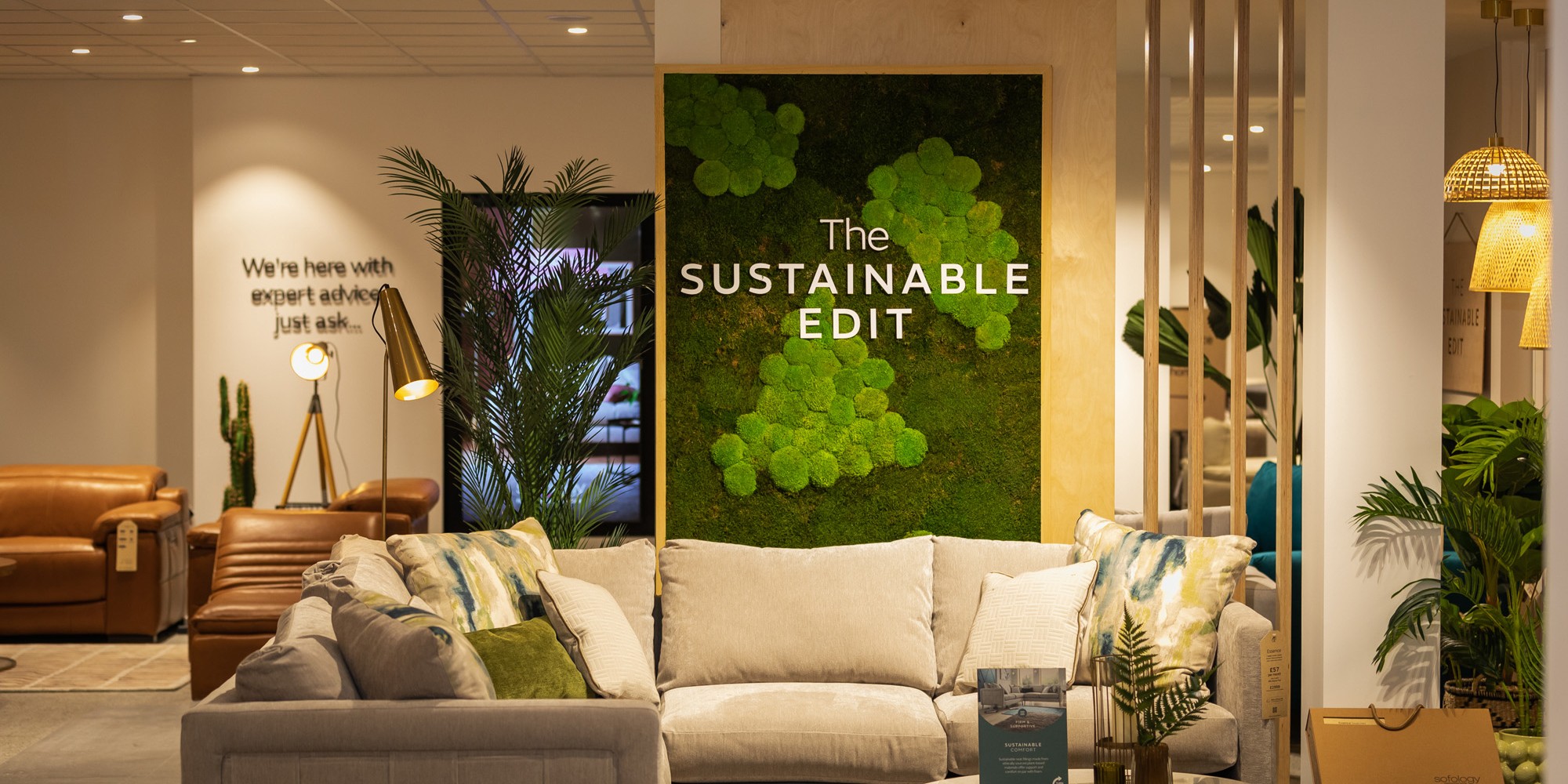
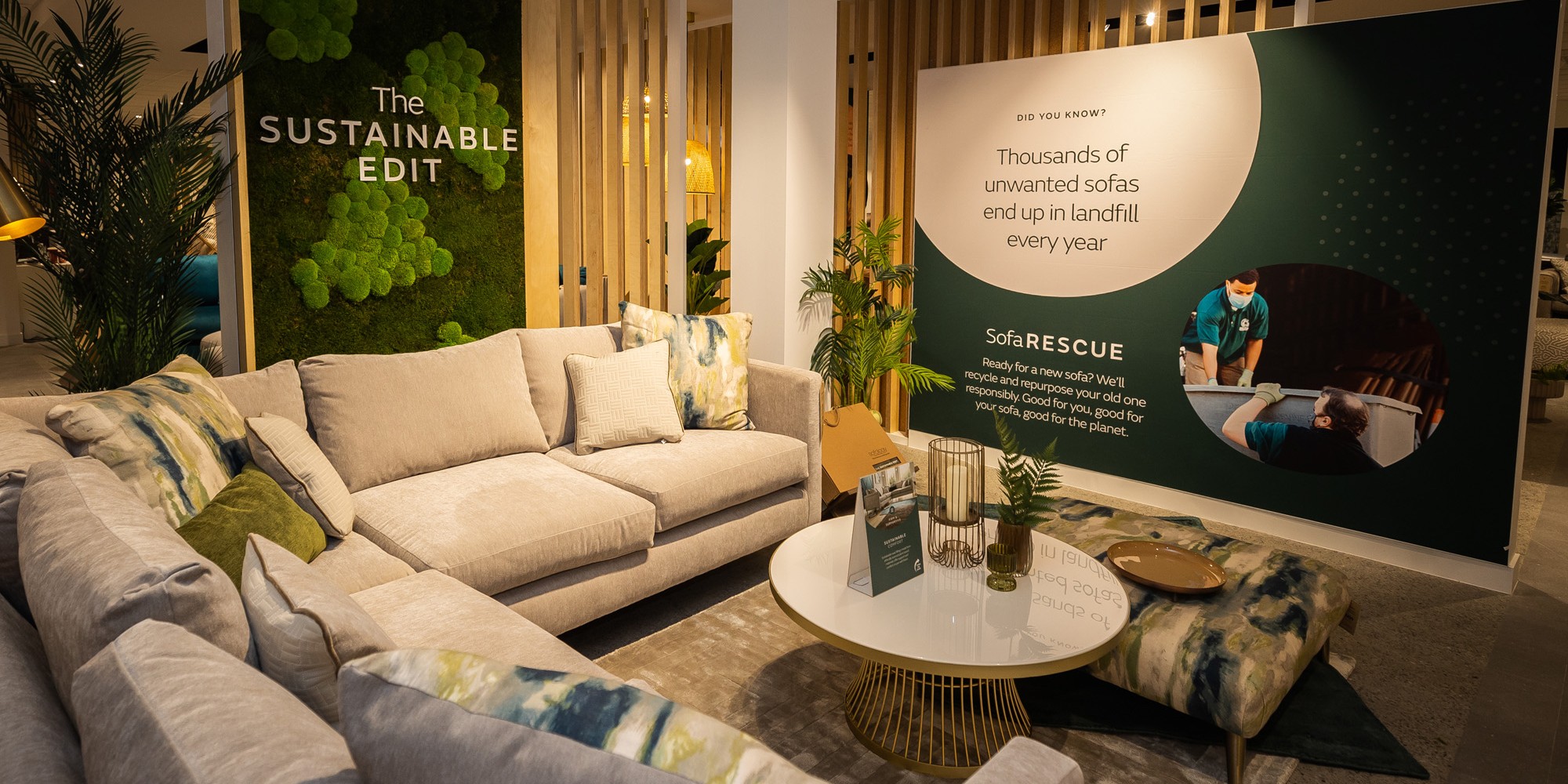
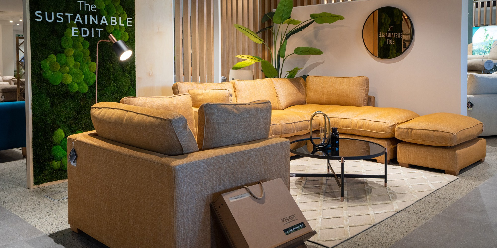
The ‘Sustainable Edit’ sits centrally as a feature within the store. Its location carefully considered amongst its surrounding room settings to allow the brand to increase/ decrease as required with flexibility and little effect on surrounding areas.
The presentation of the new ranges and brand story included info graphics while product displays use to testify and support the ‘sustainable’ name. Soft, neutral tones and materials were used within the design elements, in-keeping with the ‘sustainable’ look.
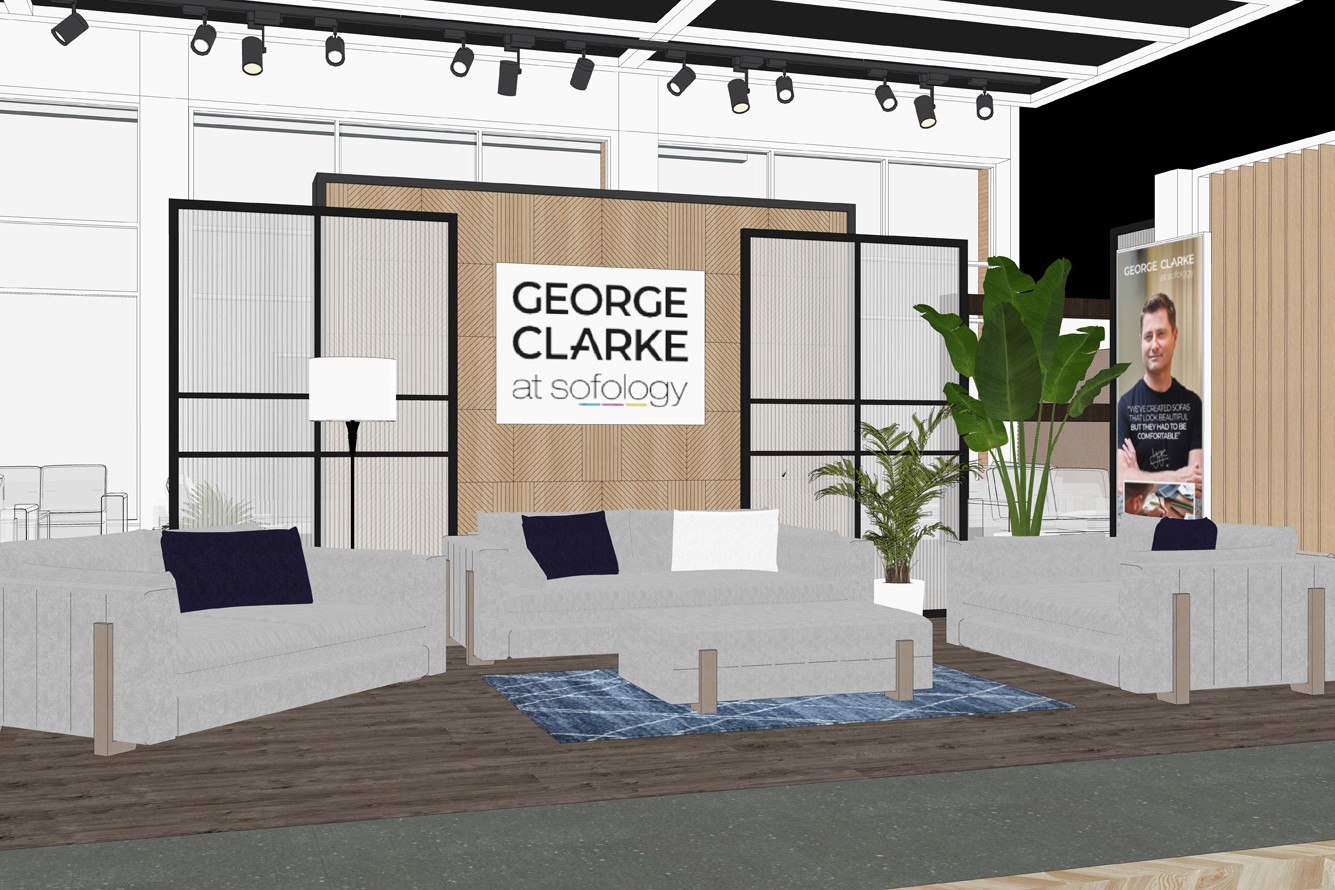
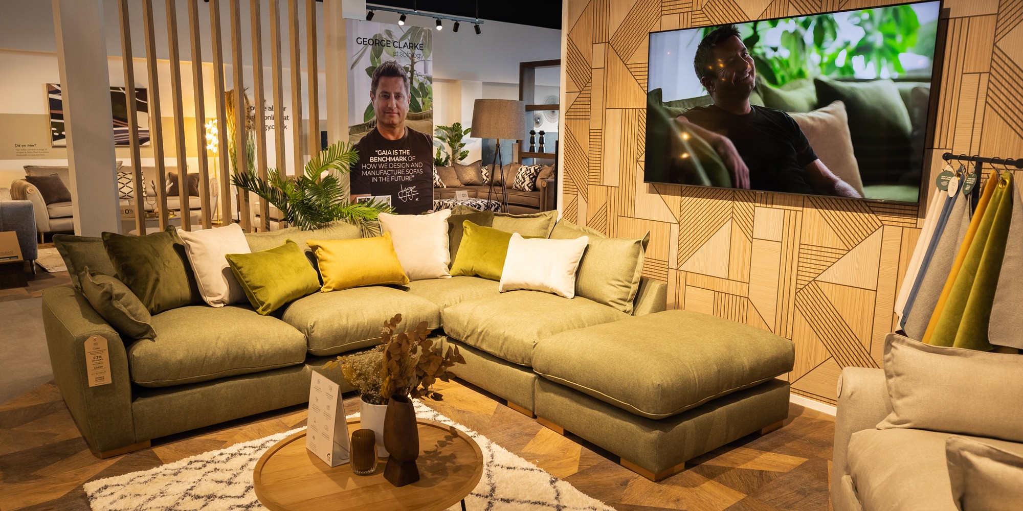
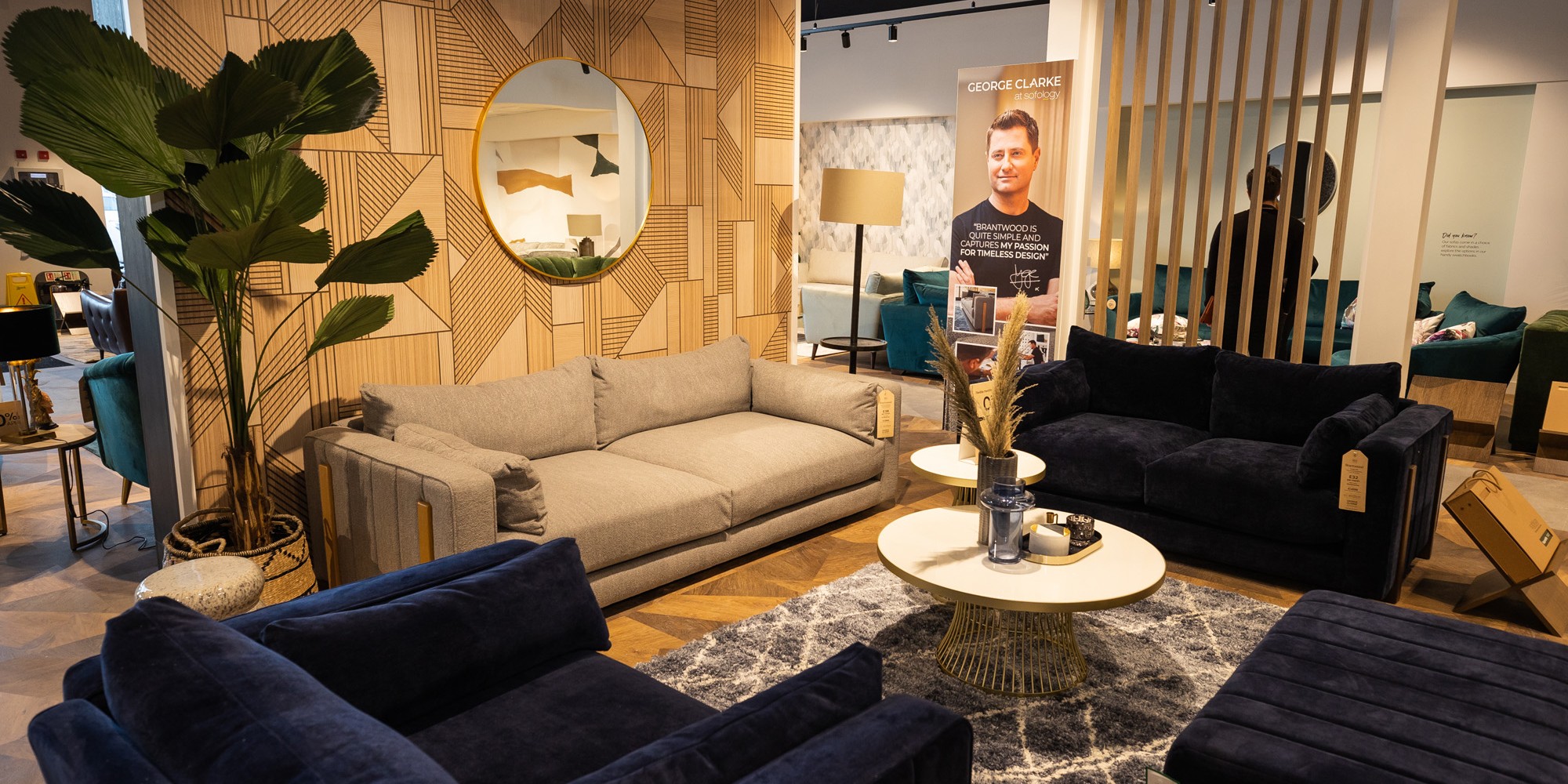
For the ‘George Clarke’ brand, the brief was to create a key ‘destination’ within their stores, to become a focal point for customers looking back through the store especially from the first-floor mezzanine.
Spanning across the mid floor area, customers will always pass through as they enter and leave the store.
The product within this brand display encompasses craftsmanship, and timeless design. The interior design concept was influenced by this, with geometric wall paneling, soft tones, and neutral finishes. Sat immediately opposite the ‘Sustainable Edit’, both brands needed to work well together and flow comfortably, to allow any overflow/ infill ranges to be easily placed should this be required in the future.
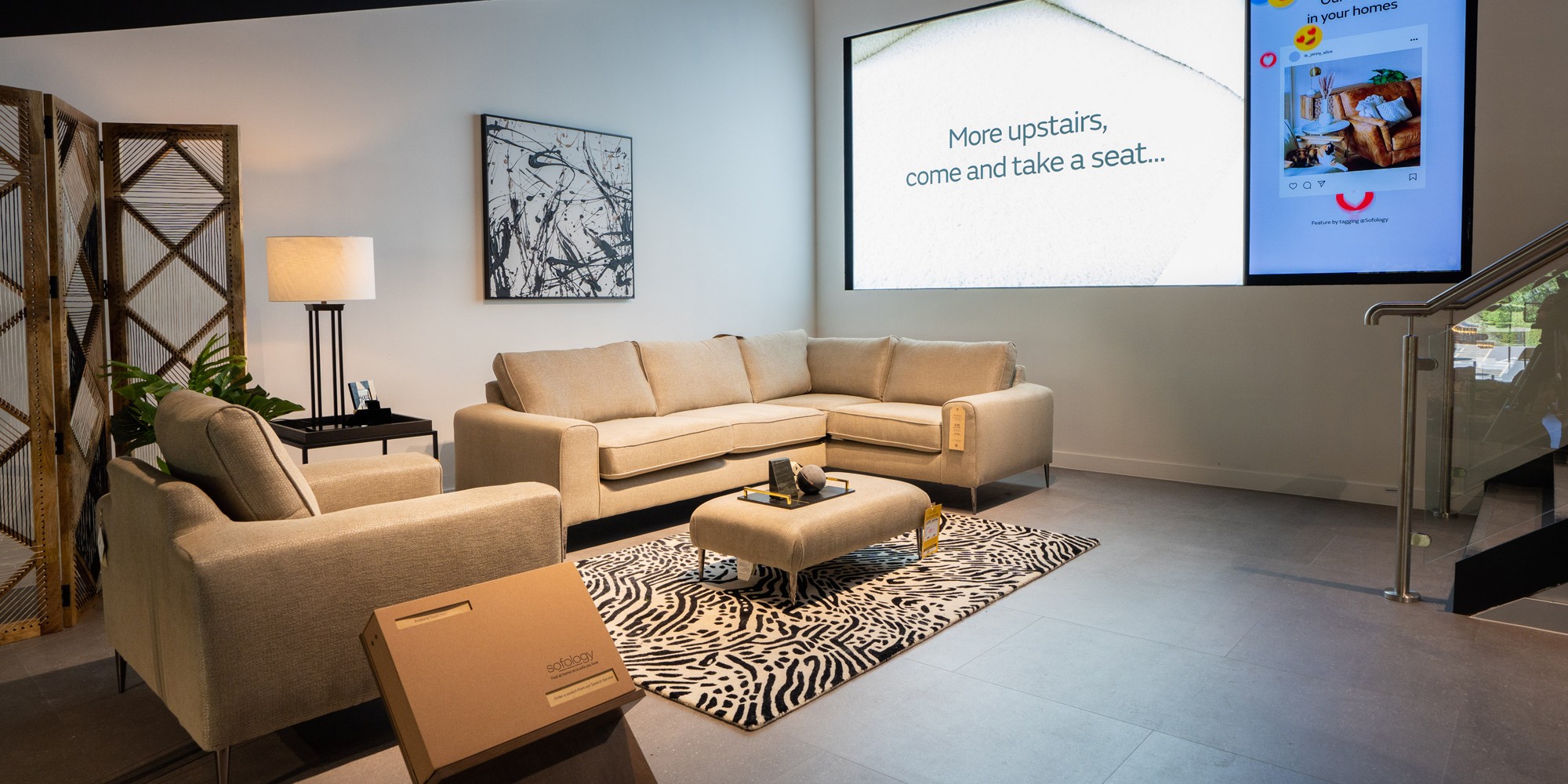
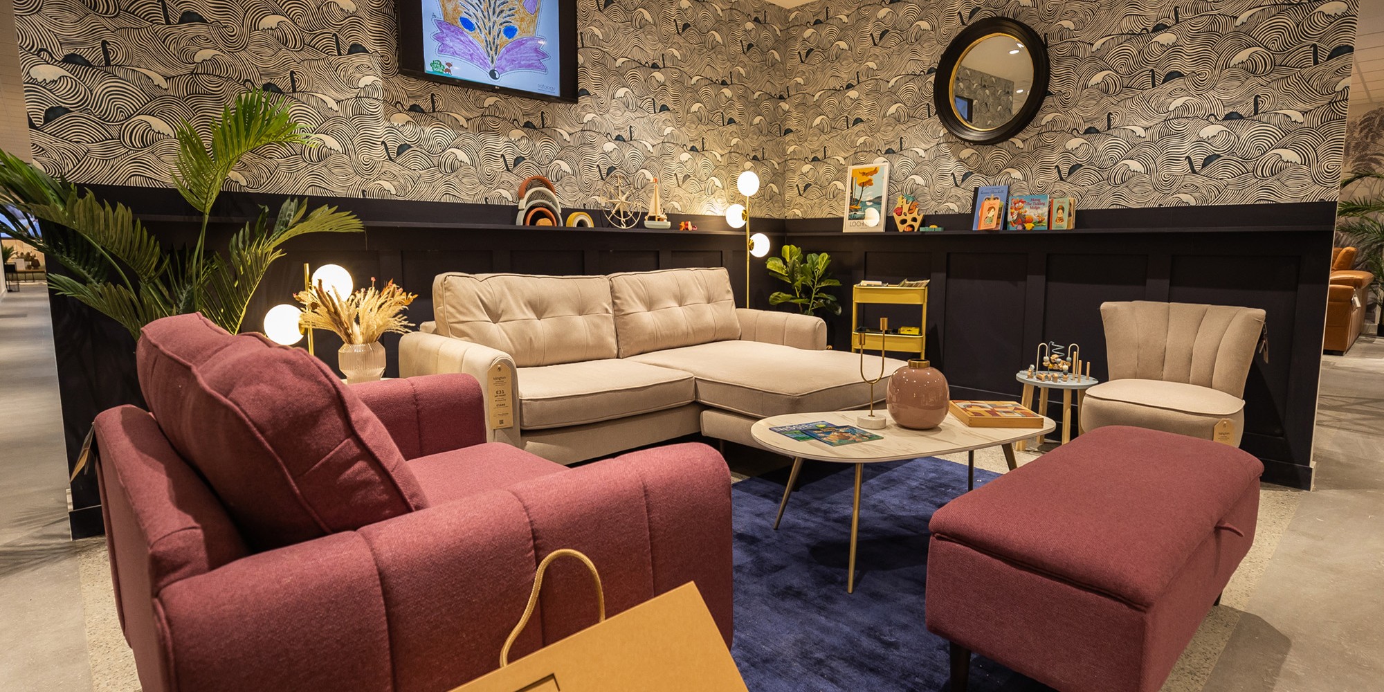
New digital applications were included at other key points throughout the store to entice browsing. For instance an ‘Entrance’ to the first-floor mezzanine was included, where an additional new brand gallery is located. This gallery was designed to give the feel of an apartment, its location within the store created a ‘walk-in’ space with a range of different furniture types, including sofas and beds.
Alongside the concept design the team at je+1 also continued to provide Detailed Design for the projects through Fit-Out drawings, Lighting and Electrical Designs, Bespoke Fixture design, all Finish Specifications and project Coordination.

What ourclient thought
"The concept as a whole, has been positively received with key elements already rolled out into the latest new store in Inverness, and plans to continue rolling out into the new and refitted Sofology stores going forwards"
Say Hello
Want to chat about a project? Fill out the form here or send us an email at info@johnevansdesign.com and a member of our team will get back to you.
