Getting Retail Lighting Right
As the phrase goes, ”Retail is ever changing” and so too should Retailers to thrive and in some cases to stay alive! It’s pretty much a given, that we all expect stores to be up to date, and provide us with exciting shopping environments and experiences.
There are many many elements in making a store successful from product, brand, sales people and environment, but in terms of presentation one of the most important factors in creating a successful store and keeping up with expectations, for me has got to be Lighting Design.
Lighting can be a detail, retail owners often don’t put enough emphasis on or in some cases don’t consider at all. Lighting in any environment isn’t just about function, it’s been evolving for so long and should be a used as the No.1 tool to create atmosphere, enhance the customers shopping experience emphasising merchandise, and also raise brand awareness.
We can't stress the importance of lighting enough, and in my opinion if it isn't being considered properly within a fit-out budget, the investment in other areas such as wall and floor finishes could all be for nothing...
Designing Lighting for Retail
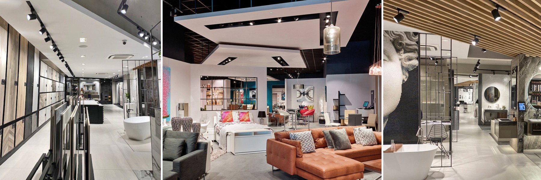
Designing a retail lighting scheme involves many factors and as lighting designers we would provide a scheme that has a juxtaposition of all five layers of light; Ambient, Accent, Decorative, Audio Visual and Signage.
The Ambient light provides a base level light that generally illuminates the circulation areas and provides a safe level of illumination, whilst Accent lighting directly illuminates and elevates the merchandise or a specific area.
To draw your attention to something we would use Decorative lights; their form can vary from pendants to table or floor lamps.
Where there are screens around your store the light emitted is Audio Visual, and then the brightest points in the store that aid successful navigation are Signage and Wayfinding.
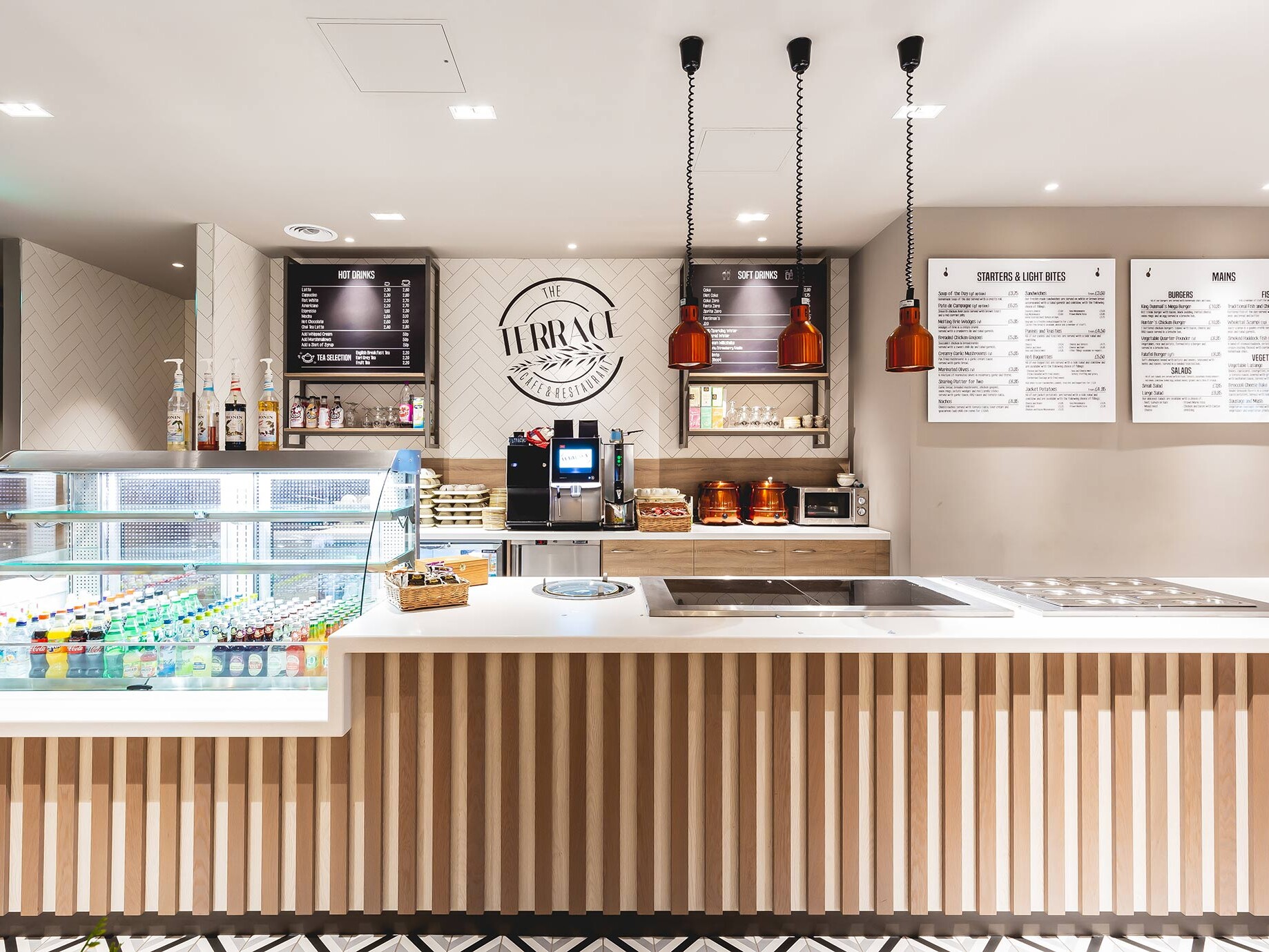

Retailers are not only competing against each other but with the internet. Making your store a complete experience for the customer isn’t something you can dismiss. Light, like the smell of your store can evoke your emotions and behaviour, and is a tool that should not be under estimated.
Whilst many retailers still believe fluorescent lights are a good option in their stores; probably due to budget, these types of fittings should not be used for shop windows or as display lighting due to its ‘flat’ appearance of light. LED’s can be used in all light layers within your scheme as they are the most versatile and energy efficient type of lighting.
Most retailers don’t sell architectural light fittings, so they shouldn’t be a distraction from the actual merchandise. As Lighting Designers there are several factors we would consider when putting together a scheme that can be quite complex, but are all so important to getting the design right.
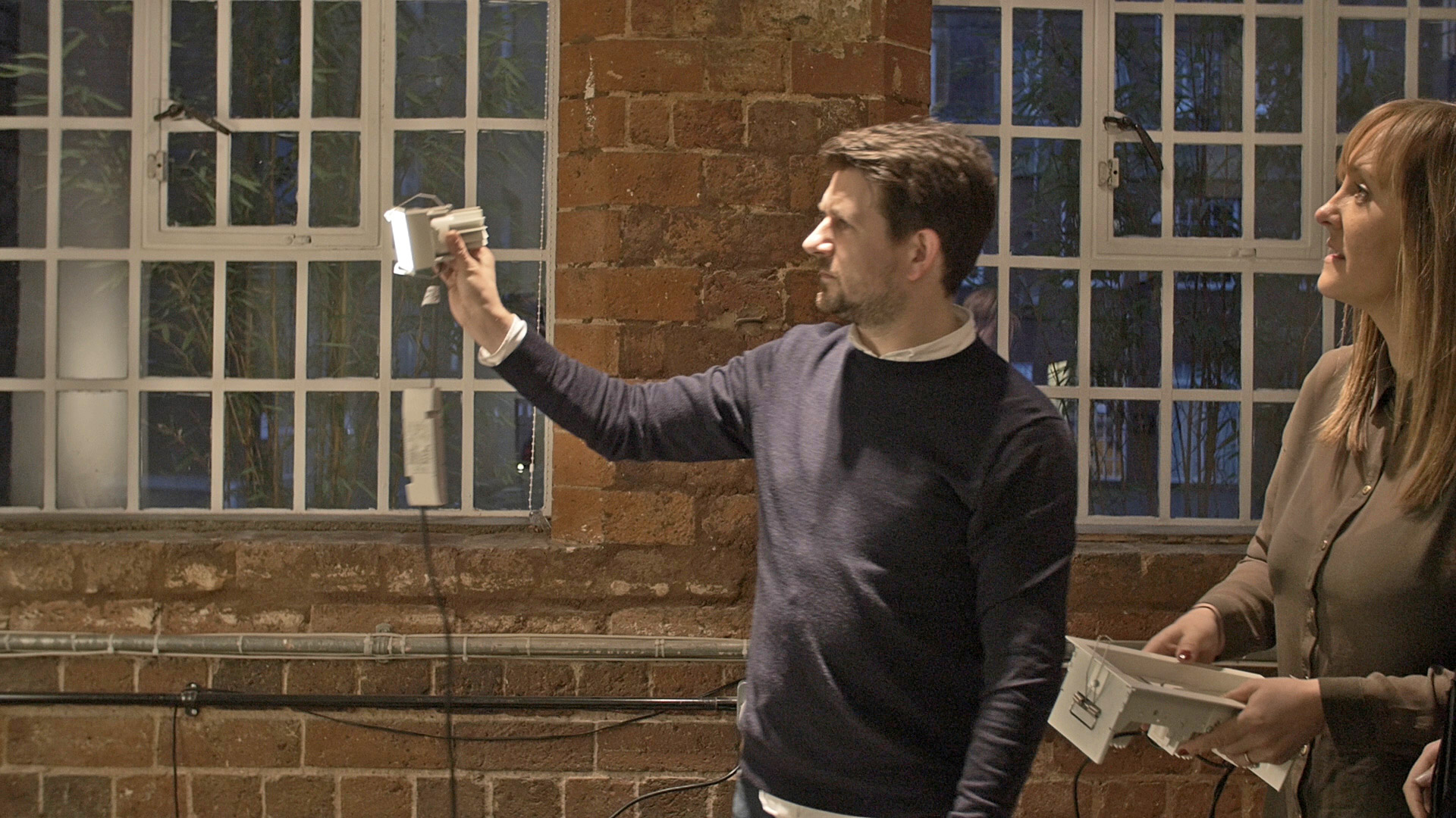
In our opinion the colour of the light is one of the most important factors. Light sources differ in colour temperature, and that measurement unit is referred to as Kelvin (K). The colour temperature indicates how visually ‘cool’ or ‘warm’ a light source is.
The lower the number the warmer the light and the higher the number the cooler the light: 1500K resembles candlelight, whereas 6500K is a cold light similar to daylight. Unfortunately, we find many retailers opt for light sources trying to replicate daylight however in most cases this just doesn’t work as this doesn’t provide a comfortable environment for customers.
In terms of product however, there isn’t really just one rule. Jewellery for instance works best under a 6500k light whereas with Furniture and Homeware Retailers, we believe that the customer should be able to view the product they are purchasing in an environment not too dissimilar to their home.
It's Not Easy Getting it Right
The beam angle is just as important as the colour temperature as it indicates the spread of light from the source. A narrow beam angle will give a concentrated light; which is good for accent or task lighting and can create the right atmosphere when used correctly.
A wider beam angle however will give a softer more general light. Getting this right is essential and why we would consider everything in your store, its layout and the merchandise to make sure this is used successfully.
Following on from the top two factors we would then consider the brightness of the bulb; the power of a light bulb is measured in lumens while the amount of generated light is measured in lux. The higher the lumens, the bigger the lux levels will be, the brighter the light emitted is.
Not to be confused with the colour temperature of the fitting, the indicator of the fittings quality is the colour rendering index (cri). The higher the index number the better the colour rendering ability. This is a measurement between 0-100, the closer to 100 the better.
A crucial factor for many retailers would be the life expectancy of the fittings they are having installed, as your store lighting will be on around 8 hours a day; in some cases 24/7. A good led will offer 50,000 hours (19 years based on 8 hours a day) as well as being energy efficient and over its course be a cost-effective source of lighting.
Something that not many people know is that you want to select your LED’s from the same BIN. LED’s are binned, or categorised, according to their brightness (lumens), colour and voltage.
LED binning is an efficient method to overcome variations in manufacturing of LED’s to lead to a better quality and consistent light
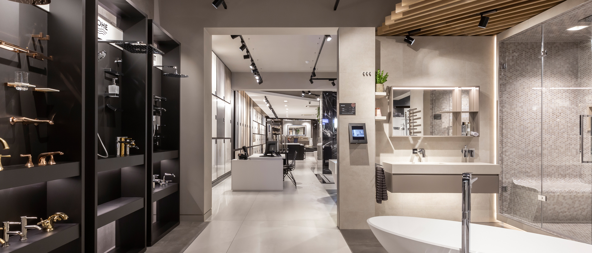
So why is the right type of lighting so important for a Retail Environment?
Retail lighting is by far one of the most important visual elements that grabs shoppers’ attention. It will attract and invite customers into your environment. Once inside you can use it to guide customers through the store and draw their attention to specific products.
Having created your atmosphere; the balance of light between merchandise and surroundings, you can affect the moods, behaviours and buying habits of your customers. Illuminating the verticals will draw the eye, define boundaries and decompress a space.
All of the above will communicate the fact that you have a well-established merchandising strategy and that you want to offer them the best experience.
Bottom Line – products that are showcased in the best possible lighting will look fantastic! This makes lighting a valuable tool to increase sales. At je+1 we are specialists in Retail Interiors and also experienced Lighting Designers working in partnership with the best manufacturers to suit your brand.
Augmented Reality
It doesn’t seem so long ago that we were talking about how technology will unquestionably be one of the key retail developments, with digitisation continuing to infiltrate our shopping habits and experiences. Fast forward to today and this statement could not be any more true!
Many retailers are now embracing ‘Smart’ technologies to improve the in-store experience in areas such as lighting and sales transactions.
With exciting developments in VR and AR, retailers are now implementing this as another tool to draw in and retain customers while they’ll continue to prioritise convenience, with many prefer to shop online from the comfort of their own home.
Retailers are introducing new and exciting ways to entice foot fall into their stores. To do this, retailers must grow and adapt to the ever changing market due to technological advances.
More recently we’ve taken a look at how Augmented reality has started to become a normal occurrence within retail stores, as well as what some retailers are doing, and how.
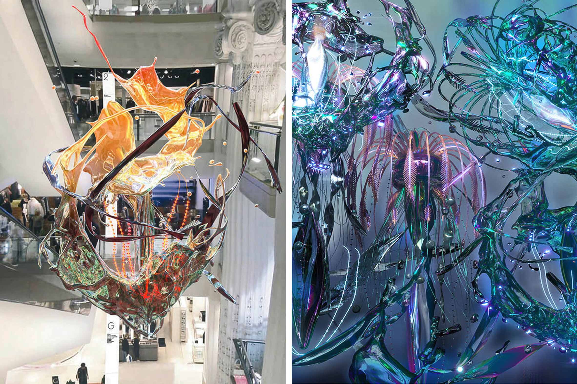
Selfridges, London
Major luxury retailer, Selfridges have recently collaborated with Digital Artist Jon Emmony. The artist created a futuristic augmented reality artwork within the Selfridges flagship store in London called Digital Falls.
Members of the public were invited to download the Digital Falls app and explore the physical artwork for themselves across the different levels of the atrium.
This is not only a great way to get customers involved, but the general public too. Many people are intrigued by augmented reality, and the fact that this was reachable by using a smartphone meant anyone could experience the digital art.
On their page dedicated to the talented artist, they explain that “Digital Falls reimagines the five-storey atrium space at Selfridges London as a column of water, filled with bioluminescent sea creature-like sculptures, pulsing with electrical signals that visualise the digital conversations and ideas that surround us day-to-day.”
The artwork encourages exploration and discovery, taking the user on a physical tour as different levels of the atrium provide different views and perspectives.
Natuzzi
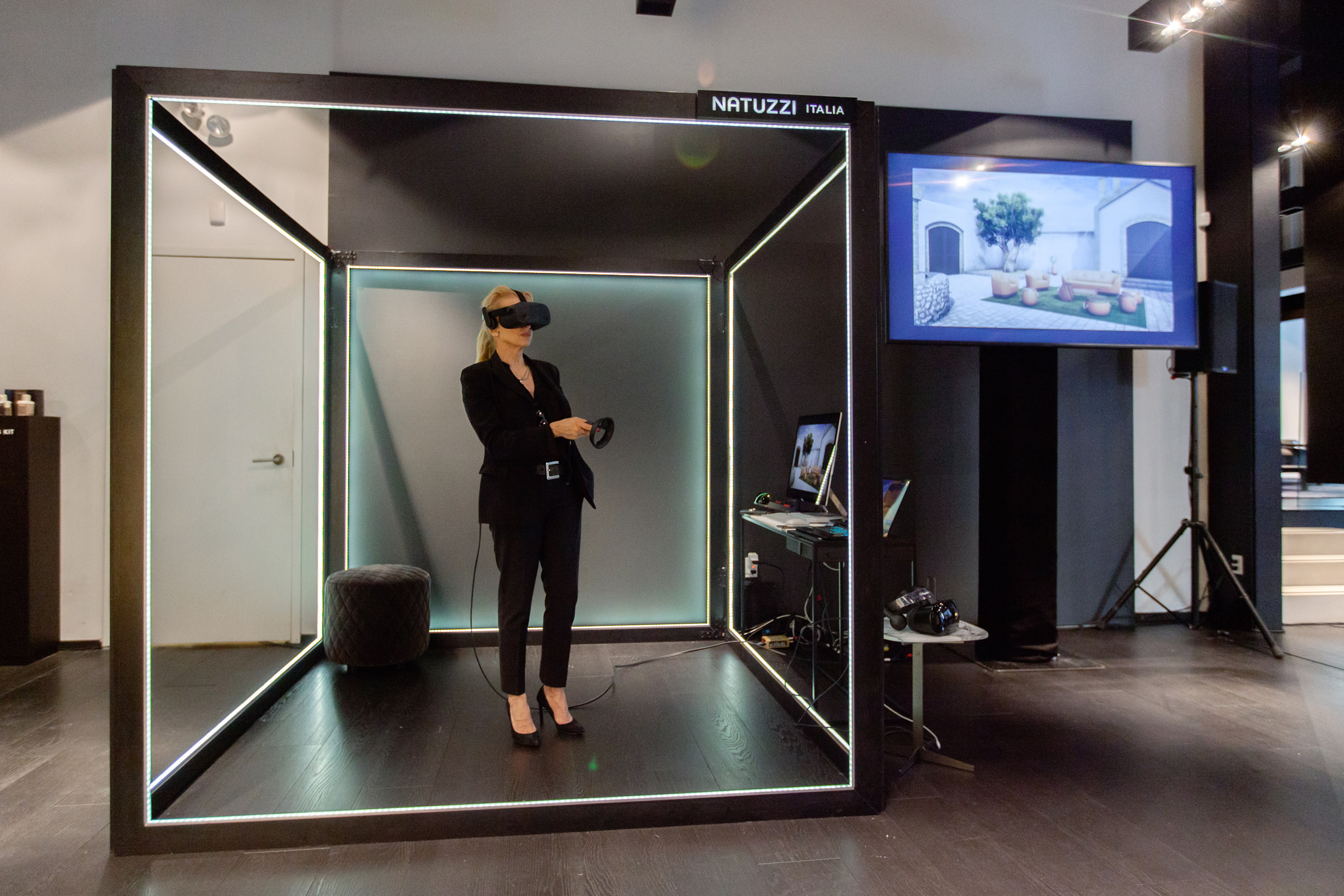
Just recently, Italian furniture retailer, Natuzzi has embarked on what it calls “a new era of advanced, white-glove customer service” by launching a virtual-reality shopping experience.
The brand’s Augmented Store is part of its New York City Madison Avenue showroom.
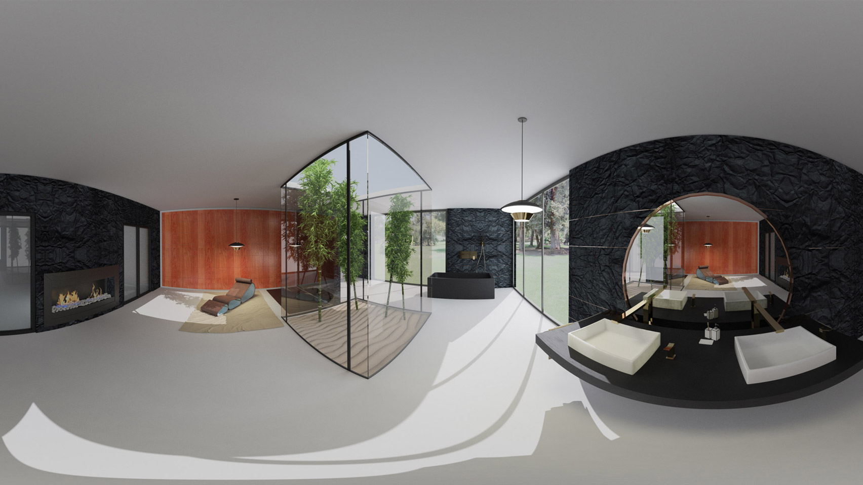
It enables customers to enter a digitally rendered version of their own home in virtual reality and decorate it with Natuzzi pieces.
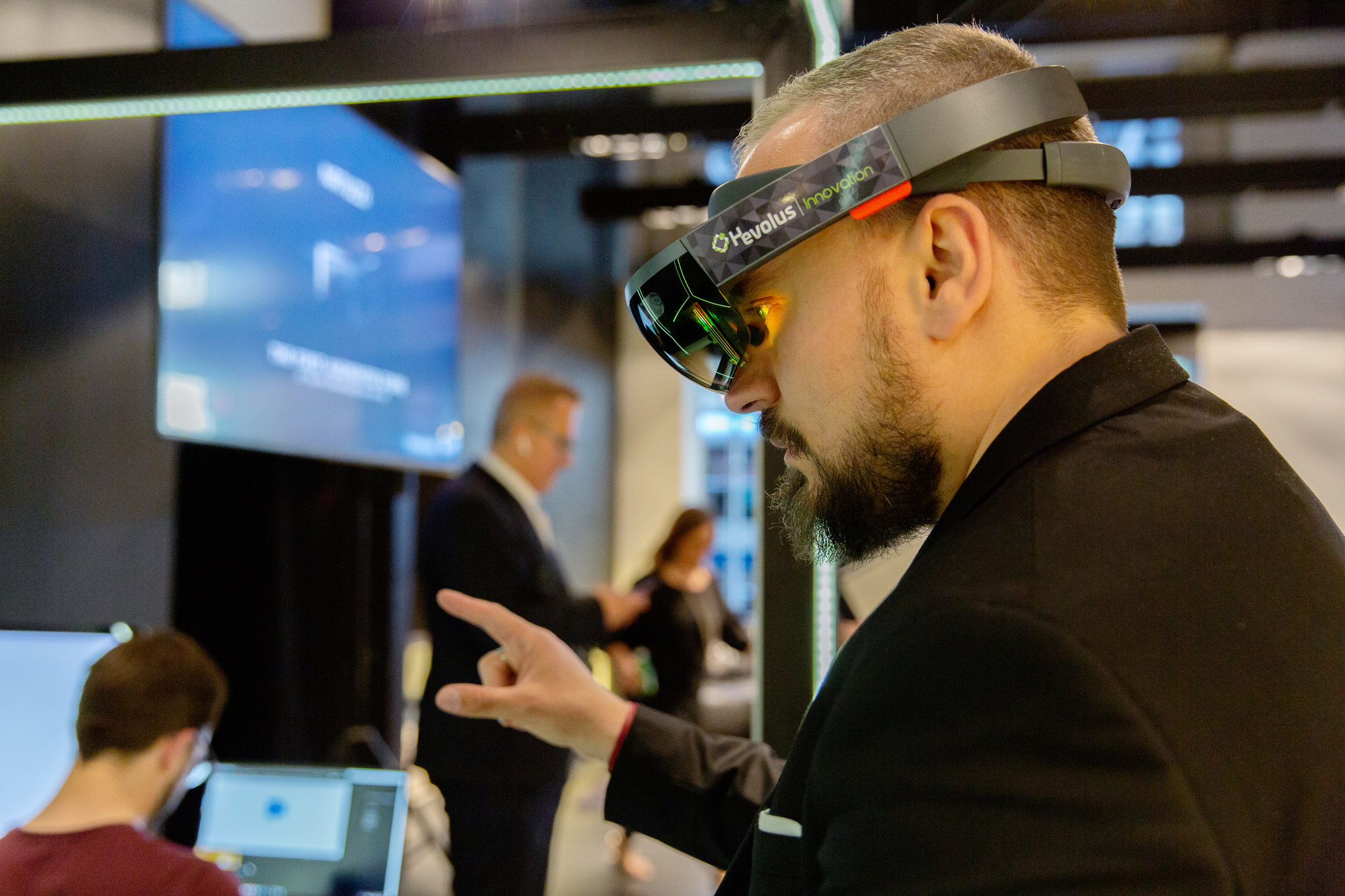
Customers wear Microsoft’s HoloLens 2 headset to interact with the environment, move products around, and change patterns and colours. They can also wear headsets in the comfort of their own home to see what Natuzzui’s furniture pieces would look like laid out in their own space, which will undoubtedly be extremely appealing to their customers.
Natuzzi worked with Microsoft and its mixed-reality partner Hevolus Innovation to develop the Augmented Store.
Mixology Awards '20/21
Working alongside John Evans Interior Architecture & Design, we were recently shortlisted for the Mixology 2020 Project of the Year Awards alongside just four other entries!
Due to rescheduling being needed because of the pandemic, both 2020 and 2021 Finalists will compete together, with the winners being announced later this year.
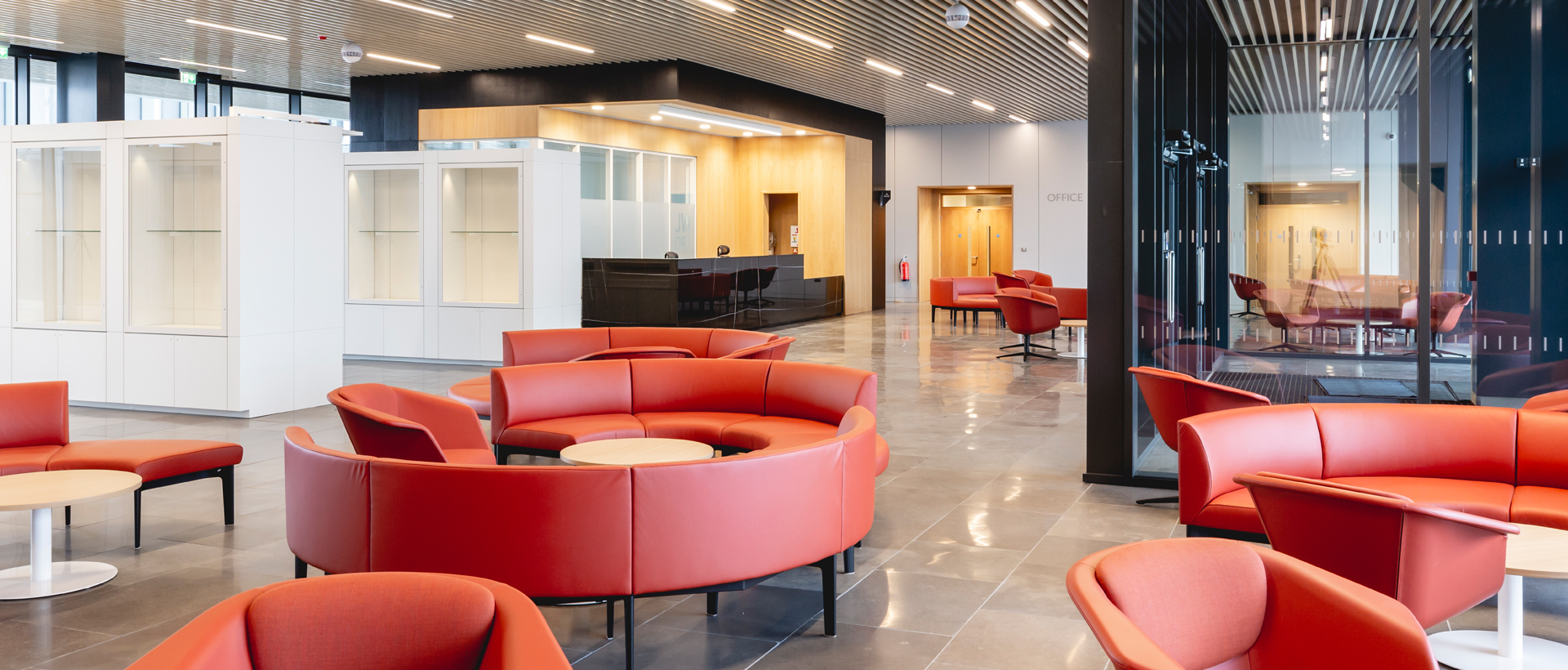
The project was a large scale development for JW.Org’s Watchtower HQ where our Commercial and Workspace Interior Design expertise was utilized.
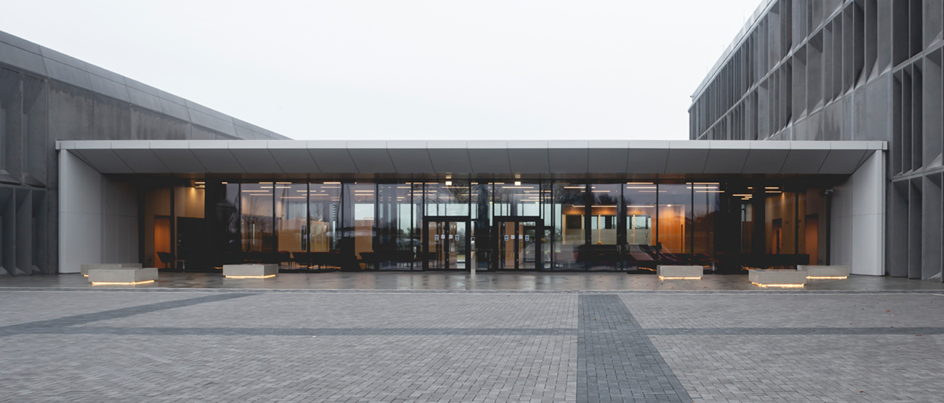
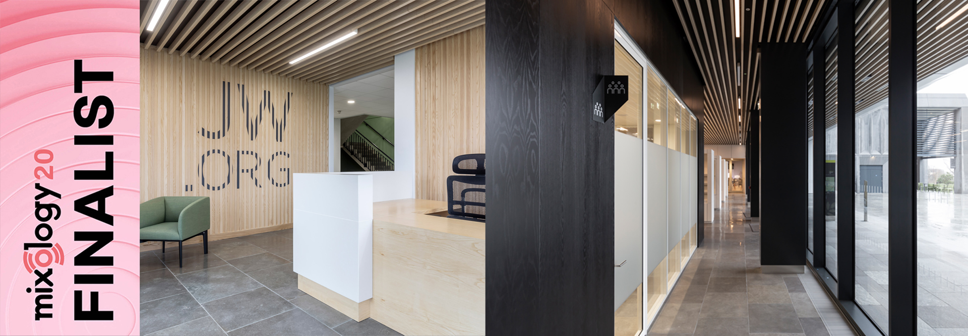
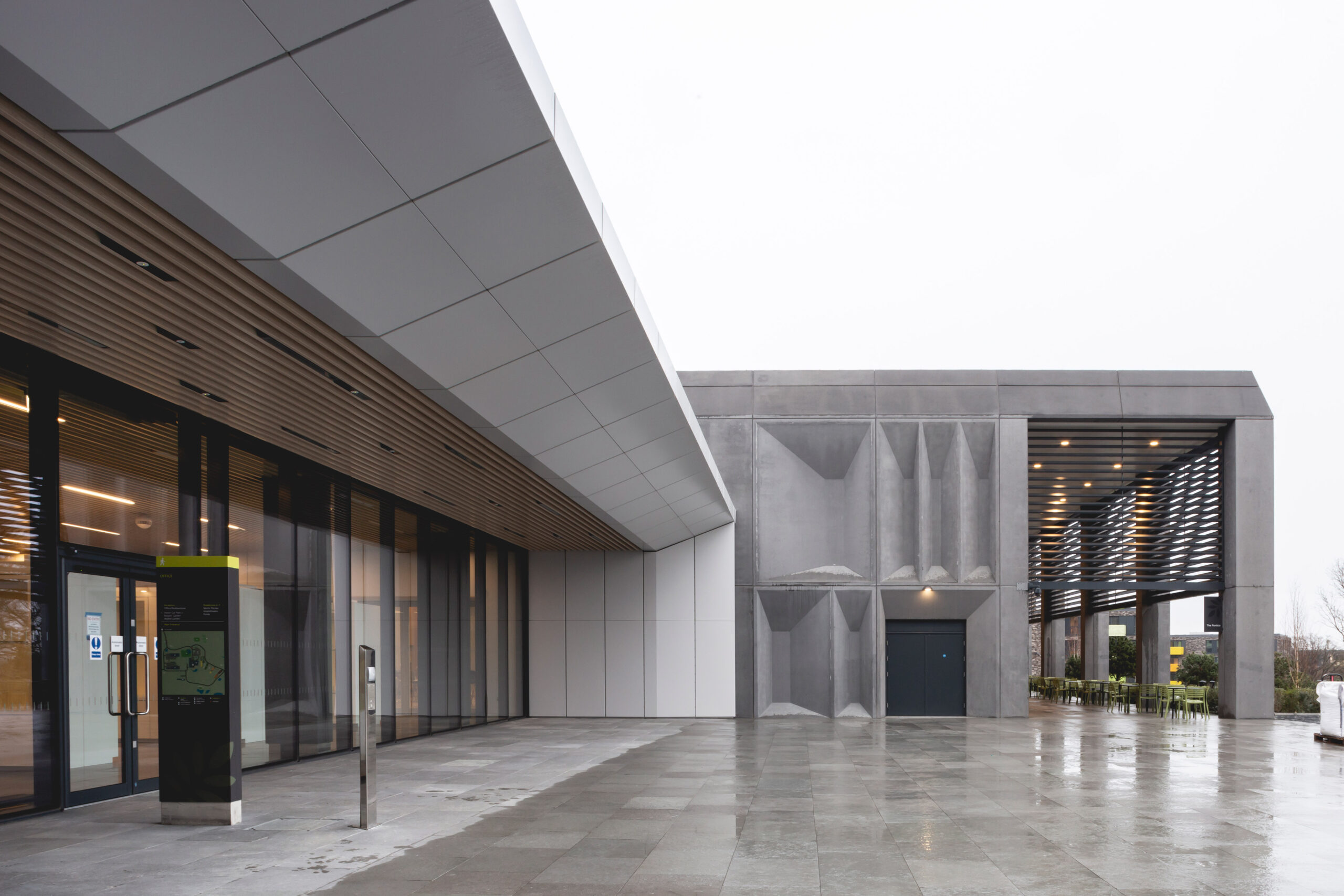
We're delighted to have been Shortlisted alongside some great projects and can't wait to share more about it soon.
- John Evans
Ecommerce to Physical Stores
With the continuing rise of e-commerce, many retailers have been fearing the presence of online-only retailers in recent years. We have also been seeing a surge in online-only brands that are turning to physical stores as a means to secure their customers.
To attract and retain customers, these retailers are trying to make stores ‘the place to be’ by creating engaging environments. Online retailers don’t necessarily need to sell their product in a traditional sense so their stores can be ‘brand spaces’ over ‘selling spaces’.
E-commerce brands are making sure that their new stores are interlaced with customer focused experiences, digital touch points and apps… But is that all?
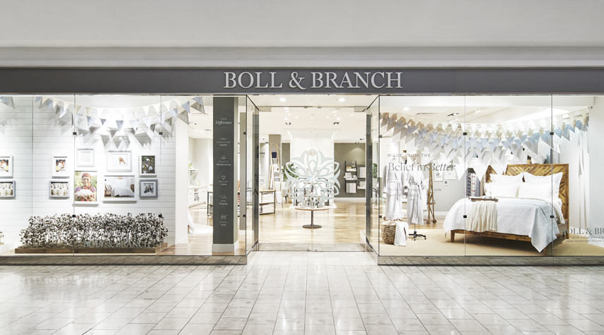
After three years of successfully selling online, Boll & Branch believe “the main reason a customer wouldn’t buy a product online was because they wanted to be able to feel it for themselves” (Scott Tannen, CEO Boll & Branch).
By opening a physical store, the brands’ story is told through photos of their trips to factories and farms to show the people making the product. Customers are also able to understand the quality of the product through the ‘thread count wall’ which shows their signature weave magnified.
Combining tradition shopping with new technology, Boll and Branch’s full range can be viewed and orders placed digitally.
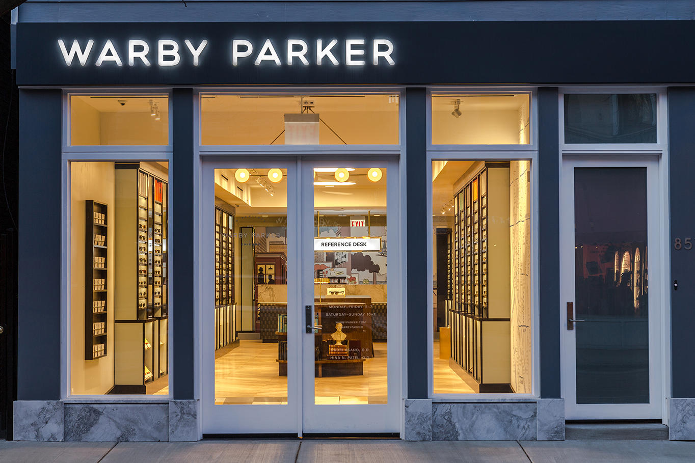
When it comes to a lifestyle experience, Warby Parker offer a physical setting which has been designed to keep customers in their stores longer, with the aim of effectively transforming themselves into a social hub.
Warby Parker started as an online-only retailer of prescription eyewear, but now has about 50 stores that enable customers to try their frames. The company is known for exceptional customer service with sales associates well-trained and knowledgeable.
Bonobos, the largest online-only clothing retailer, optimizes both an online and in-store experience for men’s clothing. Their showrooms provide customers with one-on-one service including size and style advice. This personalised service is enough of a reason to attract customers into the shop.
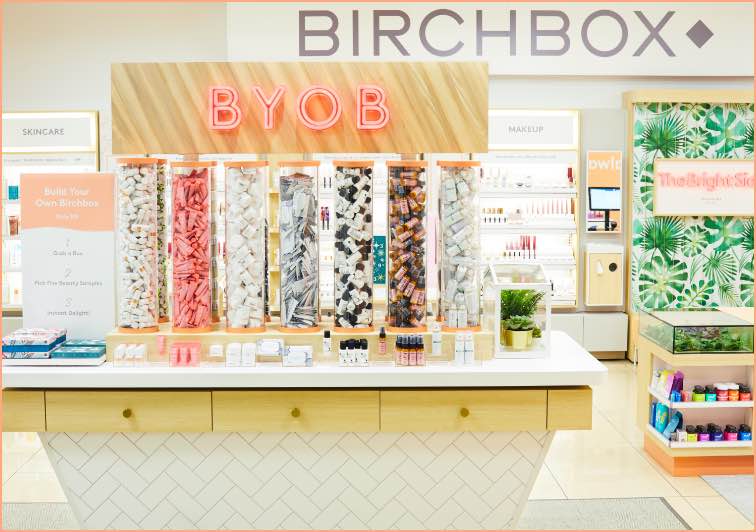
Birchbox, the UK’s No. 1 Beauty Box and leading beauty e-commerce company, has opened its first store. The store has been designed to showcase the Birchbox personal touch, by creating a warm inviting space where people love to shop for beauty.
The GIF booth is a creative way to engage customers with the brand, where they can take photos and take home branded prints or post them on social media.
With so many of the Online Retailers looking for physical store opportunities, it could be easy to think that the focus would typically be on ‘digital’!
From looking into these less obvious brands however, it shows us they understand that the main reason people choose one shop over another, has always been the same.
People choose one Brand over another because they love the experience.
